


Typo is short for typographical error, but why? It could just as well be short for typographical perfection.
“A new maxim is often a brilliant error.”
— Chrétien de Malesherbes
Legendary dipsomaniac Malcolm Lowry wrote a great poem about typos called Strange Type that goes like this:
I wrote: in the dark cavern of our birth.
The printer had it tavern, which seems better:
But herein lies the subject of our mirth,
Since on the next page death appears as dearth.
So it may be that God’s word was distraction,
Which to our strange type appears destruction,
Which is bitter.
The tavern/cavern mixup is basically the plot of Under the Volcano in a single rhyme. Wonderfully, versions of the poem that proliferate online add extra meaningless typos (and for as), proving that all errors are fractal. The more you zoom in, the more mistakes you find, until all the turtles are old bike helmets and original sin is spelled with two Ns.
“Experience enables you to recognize a mistake when you make it again.”
— Franklin P. Jones
As my recent bit of Pierre Berton braggadocio confirmed, anyone who immodestly points out a typo will inevitably make another. The elegant name for this phenomenon is Muphry’s Law, a riff on Murphy’s Law coined by Australian journalist John Bangsund. In full, it states that “(a) if you write anything criticizing editing or proofreading, there will be a fault of some kind in what you have written; (b) if an author thanks you in a book for your editing or proofreading, there will be mistakes in the book; (c) the stronger the sentiment expressed in (a) and (b), the greater the fault; (d) any book devoted to editing or style will be internally inconsistent.” If, between the moment that I’m writing this and the moment you’re reading it, spellcheck has somehow spelled Muphry correctly, then QED.
“There is something to be said for every error, but whatever may be said for it, the most important thing to be said about it is that it is erroneous.”
— G.K. Chesterton
The concept of a Persian Flaw is a wonderful metaphor and dubiously sourced historical practice by which artisans would weave intentional errors into their creations because a perfect carpet would be an insult to Allah. This excellent sales tactic for devout prospects is echoed today across some of my favourite newsletters. At
, says “any typos in this email are on purpose actually,” while over at , she says “all typos are intentional to make sure you’re paying attention.” at always says she’s “tryping her best,” which she defines as “trying your best but not quite making it.” Like a Persian carpet maker at the top of her game!“If Tetris has taught me anything, it’s that errors pile up and accomplishments disappear.”
— Alexandra Melo
The Guardian newspaper was so famous for its typos — infamously once calling itself the The Gaurdian — that it’s still known as The Grauniad in Private Eye. The only escape from such ignominy is to laugh at the joke and tell it better, which they’ve done on several occasions. You can’t help but be wistful when you read their 1997 roundup of errors that begins with the line “If anyone wanted to construct a machine for the production of error, a newspaper would probably be it.” As the information age has shown, we can do butter!
Better sloppy than slop!

Perhaps we should embrace typos as a sign of humanity, the crack in everything that lets the light in. But maybe also we’re taking on water and the ship is sinking? Anyway, here’s my Slop-Free Guarantee, with logos designed by the unparalleled Geneviève Biloski — definitely a human! But not just any human! One of the best humans! — in the typeface Vulf Sans.
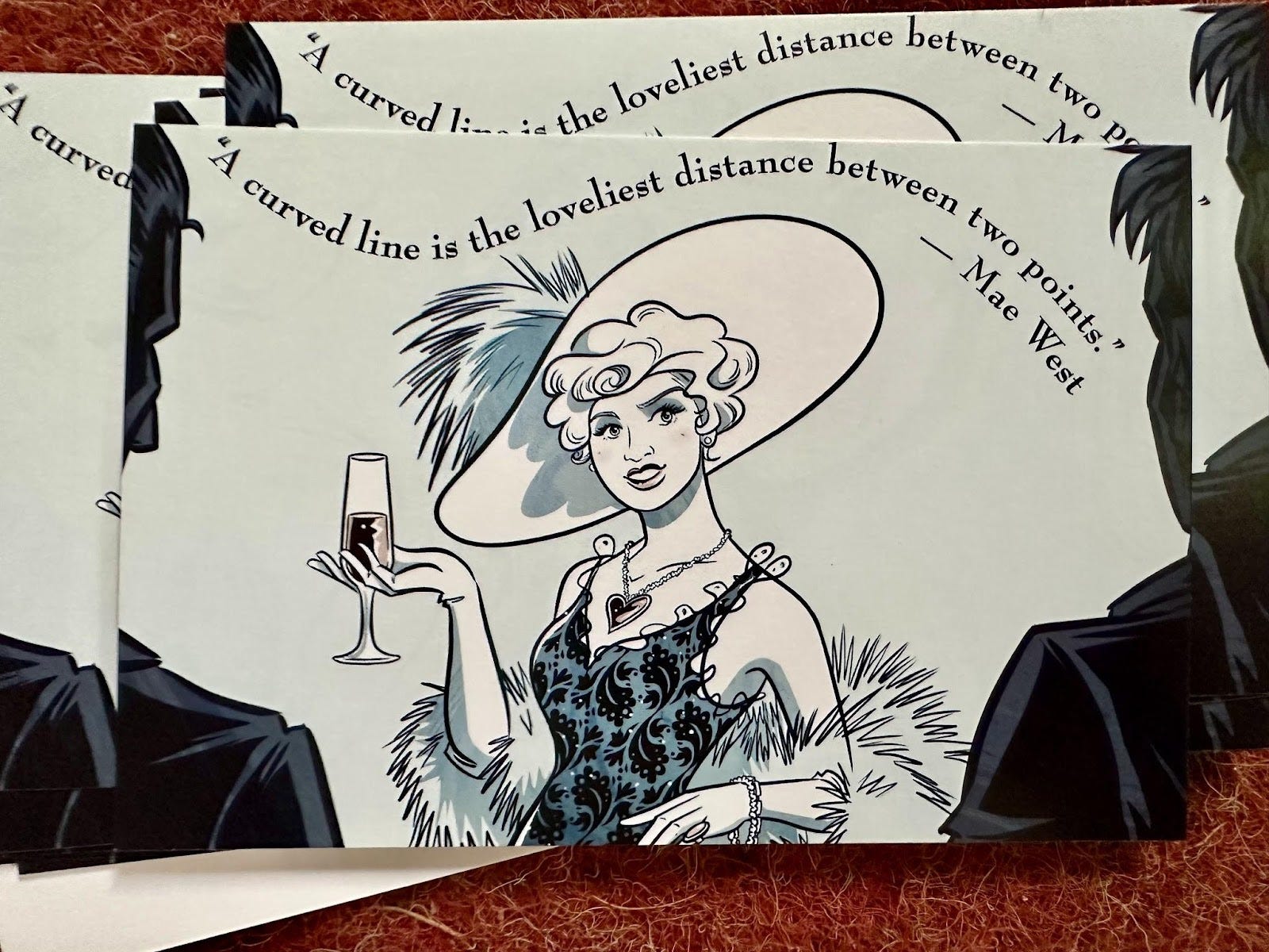
For the lovely month of June, illustrator Ben Shannon chose to interpret this geometric theorem by Mae West:
“A curved line is the loveliest distance between two points.”
— Mae West
The printed cards pictured above will be mailed out to my paying subscribers this weekend! Join them!

“An expert is a person who avoids small error as he sweeps on to the grand fallacy.”
— Benjamin Stolberg
Do Prague magicians use spell Czech? That’s truly the question of the weak! Answers next Thursday, if you choose them.

Does Issue No. 312 of Get Wit Quick truly understand the meaning of the word fractal? Don’t I mean recursive? Or am I making an elaborate typo joke? Yes, that’s what I’ve been doing this whole time! The mascot is a magpie named Magnus after the magician in Robertson Davies’ Deptford Trilogy. The title font is Vulf Sans, the official typeface of the band Vulfpeck. The book was Elements of Wit: Mastering The Art of Being Interesting. Tape the ❤️ below!
AHHHHHH.
This is relation to both the mention (thank you) and the amount of tryping that happened in my week (a lot).
Dear Benjamin,
I love this:
“Experience enables you to recognize a mistake when you make it again.”
— Franklin P. Jones
And this:
“If Tetris has taught me anything, it’s that errors pile up and accomplishments disappear.”
— Alexandra Melo
And this:
“A curved line is the loveliest distance between two points.”
— Mae West
Thank you for sharing as always!
Love
Myq