

The Wit’s Guide to Foibles
Or, lovable warts
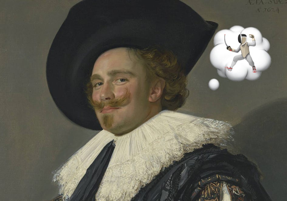
All great art is made of foibles, though sometimes they also use paint. The artist has to show us the human condition, warts and all. But if those warts are so unappealing, so gnarly, so repugnant that we can’t relate to them, we can’t connect. So instead the best artists depict a gentle fault, the ones we can manage to see in ourselves and thus forgive, a lovable wart: A foible.
“Every man is a damn fool for at least five minutes every day; wisdom consists in not exceeding the limit.”
— Elbert Hubbard
For every foible, there is a forte. That’s not a law of human character but a simple fact of fencing, from whence those two F-words originate. The forte of your blade is the bottom third, the strongest part of the steel. The foible is the tip of the sword, the weakest part. And while it would be wonderful if there were an elegant French word for the middle of the sword, between foible and forte, a metaphor for how we shuffle through most of the world most of the time, the official name is, unfortunately, the medium. Thanks, fencing.
“People who think they know everything are a great annoyance to those of us who do.”
— Isaac Asimov
Not to brag, but I was in Amsterdam a few years ago on a carefully orchestrated work-trip layover and paid a visit to the Rijksmuseum to see all the Rijks. They had a big exhibition on Frans Hals, the painter whose copyright-free work has so often graced the top of this newsletter. It was quite wonderful: The Dutch master’s portraits feature subjects with mischievous smiles, twinkle-filled eyes, shiny red noses, and the distinct impression they know something you don’t.
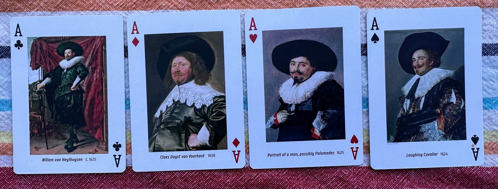
There’s life in them there Dutchies! How did he do it? With his paintbrush, duh. But more specifically, as the panels explained: “Frans Hals is the indisputable master of the loose touch, his brushstrokes dancing across the canvas. This free and expressive painting style was unique at the time, as most of his contemporaries favoured precision and a smooth surface.” He embraced foibles!
“There is, perhaps no surer mark of folly, than an attempt to correct the natural infirmities of those we love.”
— Henry James
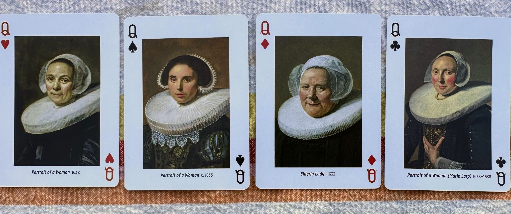
“Contemporaries spoke of a rough style, which might seem easy to imitate at first glance,” the program reported. “Connoisseurs, though, understood that this style was far more challenging than a polished, clean one.”
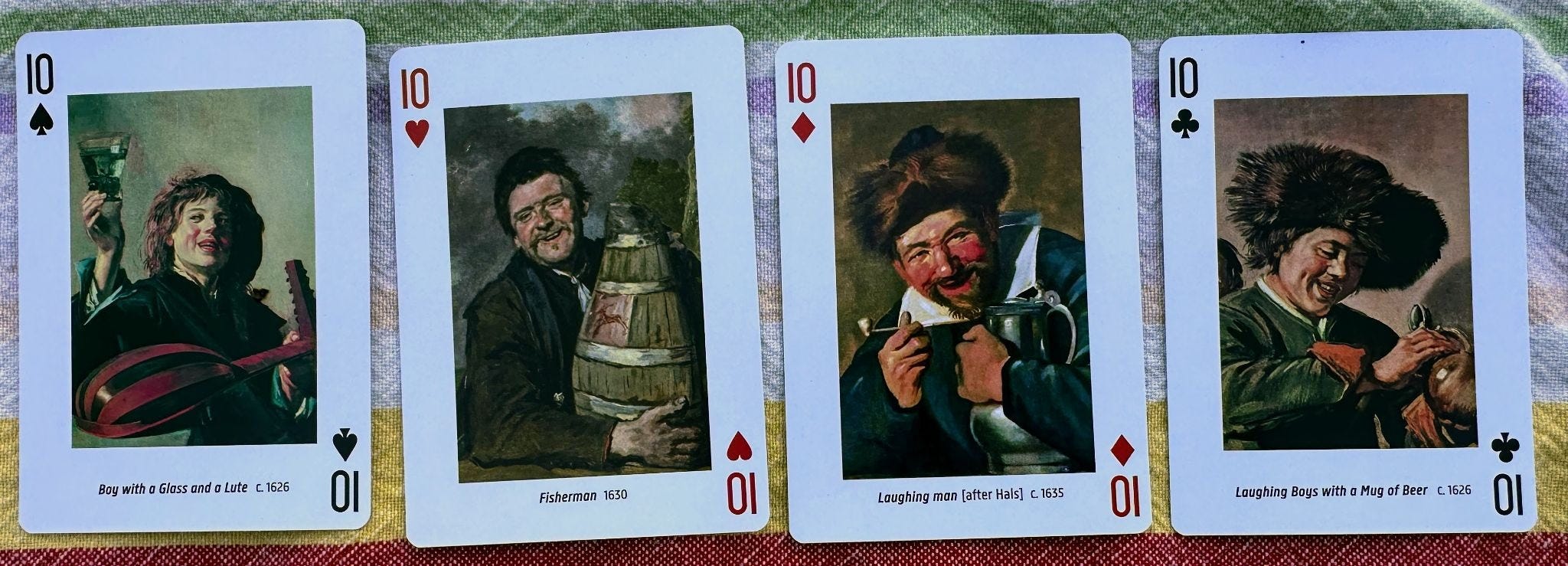
His subjects didn’t just sit for him; they also laughed, joked, played music, and drank. And that’s how the haters got Old Frans: Don’t you think it’s just a bit suspicious that this guy is so good at painting drunks? Or as the curators put it, “in the 19th century, his technique was more often associated with his fondness for alcohol, a perception heightened by his paintings featuring merry drinkers.”
“An alcoholic is someone you don’t like who drinks as much as you do.”
— Dylan Thomas
Frans Hals died penniless and spent a couple hundred years in obscurity, his ability to capture the human condition used against him until his genius was finally recognized. A foible is a lovable flaw, which means the line between fault and folly is drawn by the observer. Contemporaries may look askance; connoisseurs may look twice. Is that a charming quirk or a red flag? More often than not, it’s up to you.

“As he resigned himself to the acidiae of mortal illness, he was beginning to acquire the foibles of old age: a liking for a small treat, a fussiness about routine, a reluctance to bother with even his oldest acquaintances, an indolence which makes even dressing and bathing a burden, a preoccupation with his bodily functions.”
— P.D. James
I know you all wonder why I include Dishwashers here week after week. Am I, you might ask, yanking your chain? I am not! Is this a foible? Yes! I found some compelling source material on this subject and I think there’s something there. But also I got swept up in The Odyssey and would be ready to dip my toe into that wine-dark sea. Decisions!

Approximately each month, my paid subscribers and I exchange some of the best things we’ve read, seen, heard, and experienced in a special issue called Get Wit Picks.
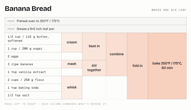
This week, some clever graphic design that could change the way you cook, as shared by my pal Tyler. As everyone who’s ever looked up a recipe online knows, the perverse incentives of the early internet pushed chefs and bakers to lard their instructions with useless backstory and SEO-optimized digressions.
But then, even traditional cookbookery is counterintuitive. As Tyler texted, his father “used to complain about Gourmet magazine and how they never listed the ingredients, they just revealed them in a narrative. ‘Once the water is boiling, add the skin of seven oranges.’ Oh, I need oranges, okay.”
Enter Juan Buis’s Recipe Tables, a format that renders every recipe into a simple chart you follow as you go. Drop any recipe or link into the site and it’ll tableize it for you. It’s an engineer’s idea through and through, and your results may vary. But even as someone who loves narrative, sometimes you just want to make the damn banana bread.

Get Wit Quick No. 381 was only irritating if you read it wrong. When my son returned from camp, even his loud chewing was somehow lovable. The misophonia became misophilia! That can’t last, of course. The mascot of this newsletter is Magnus the magpie, named after the magician from the Deptford Trilogy. The title font is Vulf Sans, the official typeface of the band Vulfpeck. The inferior-for-now and still free AI replicant is at getwitquicker.replit.app. The book was Elements of Wit: Mastering The Art of Being Interesting. There’s a crack in everything, that’s how the light gets in. Tap the ❤️ below if you would like your frailties to be appreciated. If you lack foibles, don’t tap!
To get a head start before I die, I'm also living my first hundred years in obscurity.
Loud chewing is never lovable, sir. Right, fellow misophones?