I met Jason Logan at my first real gig in journalism, a summer internship at Saturday Night magazine. He worked with the iconic Leanne Shapton in the art department, livening up the gloriously large pages of the weekly magazine with his clever line art. He went on to creatively direct all manner of publications, and most creatively campaigned to be the creative director of the city of Toronto. (Sadly, you needn’t spend much time in this town to realize the position doesn’t exist.) And now he’s become the reigning world champion of natural pigments, earning the title Wizard of Ink from The New York Times.
So I was tickled not pink but a natural rubicund magenta when the proprietor of
agreed to become June’s Riposte Card Artist. He quickly chose this excellent quip from my hand-curated selection of illustratables:“Pleasure is more trouble than trouble.”
— Don Herold
(Who, you might wonder, was Don Herold? My favourite type of quipster, a third-string newspaper columnist of the golden age of print, the sort who, in the words of Don Marquis, mastered the craft of “stroking platitudes until they purr like epigrams.” Perhaps most famously, he proclaimed that if he had to live life over, he would pick more daisies. His long out-of-print books include Drunks are Driving Me to Drink, Doing Europe, or Vice Versa, and My Compassionate Goldfish, and among his other bons mot are “Babies are such a nice way to start people” and “Work is the greatest thing in the world, so we should always save some of it for tomorrow.”)
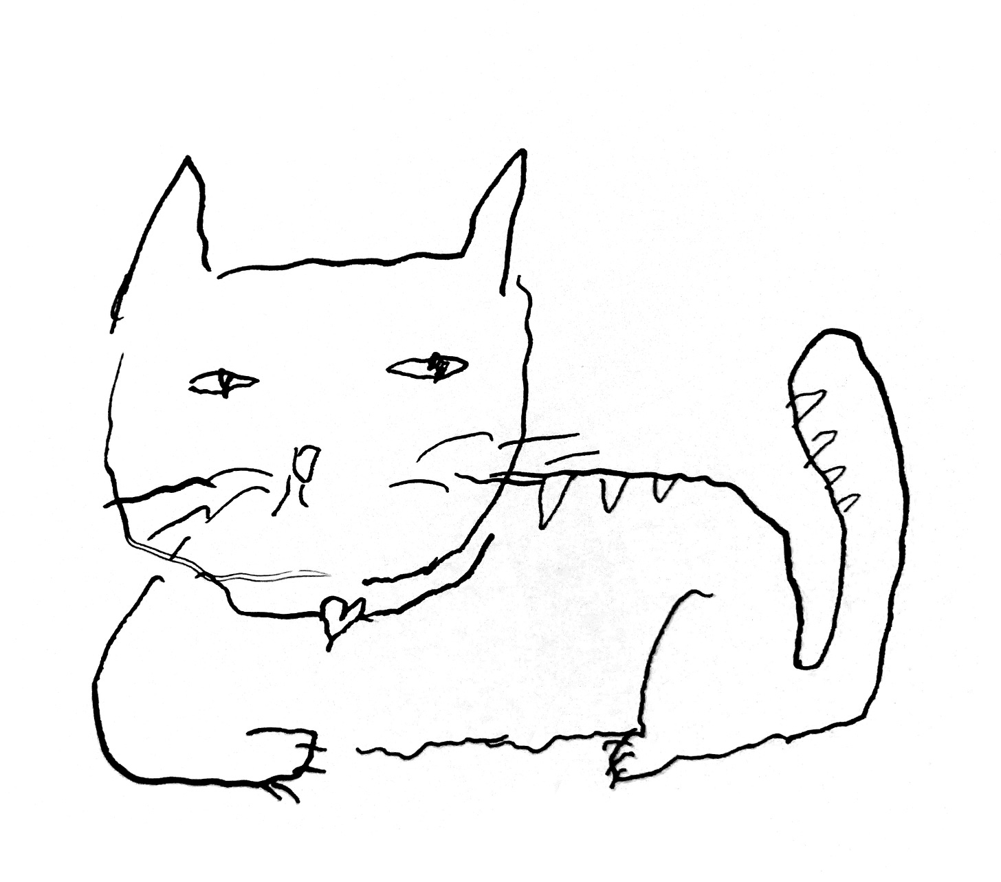
Logan offered up a series of “existential-minimalist lineart” on the quip, all as simple and profound as Herold’s line. First there was this cat, whose gaze suggests she has deeply internalized the wisdom:
Then there was this literal packaging of the two items, titled Nightstand:
After that, Logan simplified pleasure and trouble into two clever icons, with a character making the wrong choice:
From there he went back into the animal kingdom for the runner-up Riposte Card:
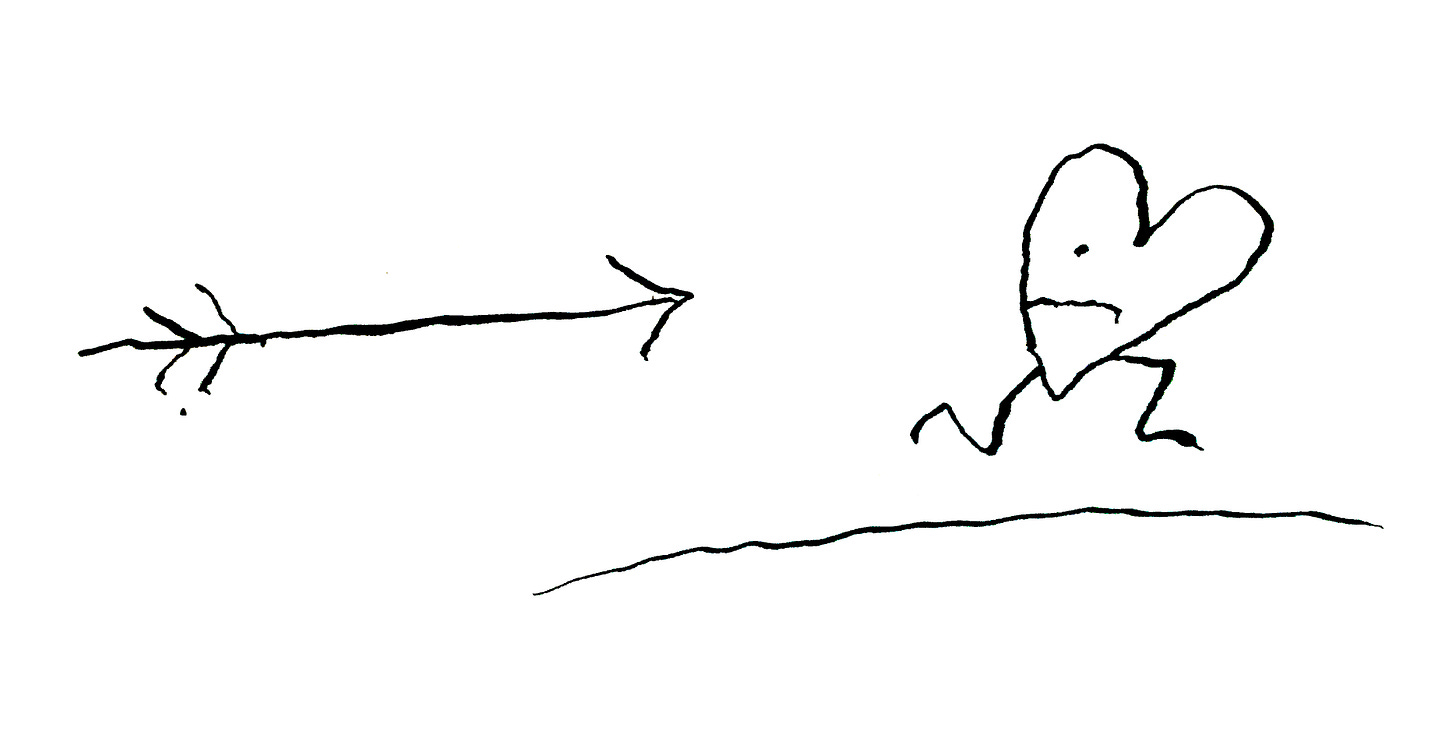
And then there was the winner, the heart that isn’t quite sure it wants what it wants.
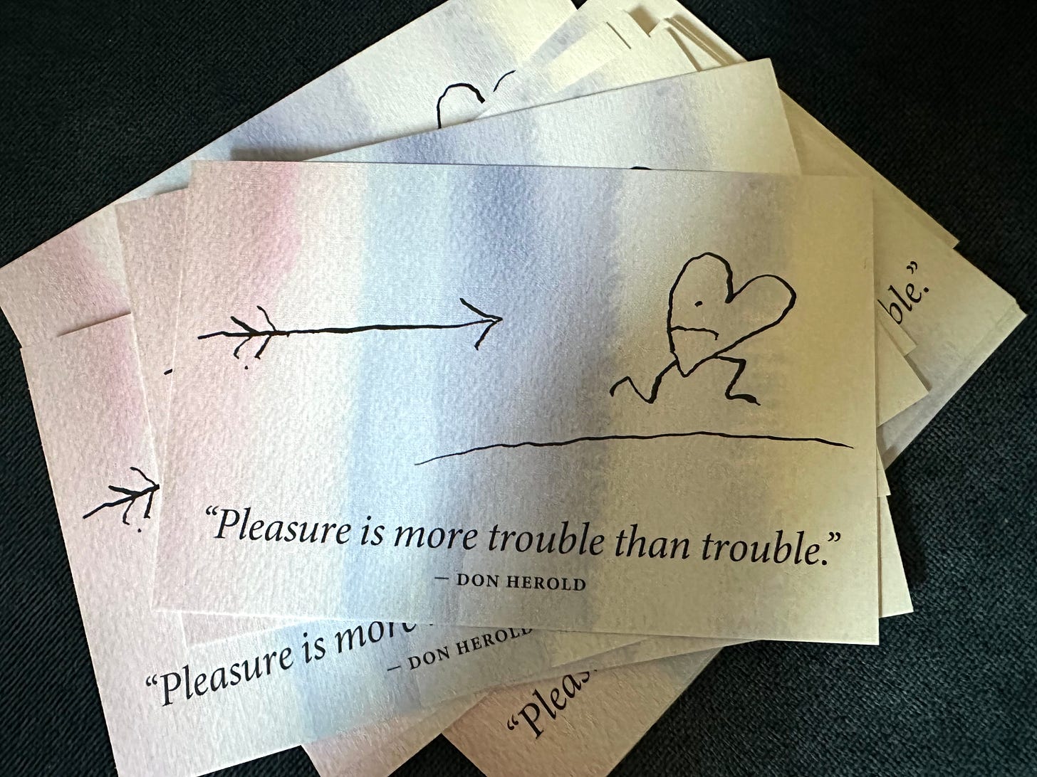
Add a sublimely inky gradient and print it on premium linen and you’ve got June’s Riposte Card, three copies of which were mailed out earlier this month to paying subscribers of this newsletter.
Dear reader, if you made it this far, it would be my absolute trouble and no pleasure at all to send you this excellent limited-edition artwork. Just subscribe below at any tier and I’ll send a scribbly heart running your way.


